Take your seats for the Colour of the Year 2019
Forget Brexit. Forget the Party Conferences. The real news of the week is next year’s Dulux Colour Of The Year.
Now it may be easy to get a cheap laugh at the expense of the people whose job it is to entice us with new colours that reflect our collective subconscious hopes, ambitions and fears. (That, of course, is why I like doing it – it’s cheap and easy: what’s not to like about that?).
However I shouldn’t bite the hand that feeds me and, despite my stubborn streak of cynicism (I like to believe it’s healthy cynicism – sounds better) there is a huge amount of work that goes into these things, and not all of it is done over lunchtime G&Ts.
I attended a presentation from Dulux a couple of years ago where the person in charge detailed their whole research procedure, resulting in an announcement every year in October at their Colour Futures seminar. This influences everything from housepaint to cars, carpets and fridges. But their prophecies face stiff competition from other companies, and probably the most influential of these is Pantone. Their colour decisions tend to lead the fashion industry and other paint companies.
Pantone was started in 1963 as a system for identifying, matching and communicating colors for consistency across the print and textile design industries. Leatrice Eiseman, Executive Director of the Pantone Color Institute said in an interview: “You start to notice certain colors getting more attention in the fashion field [first]. …We all travel a lot—those of us on the committee go to London and Paris and Milan, a lot of the major places where you see fashion on the street, and you see evidence of certain colors. Fashion’s definitely a large part of it, [but] we also have to justify naming a color by seeing it in other places as well. We look at new films coming up. What colors are being used? Is there a new effect being used? We look at upcoming cars, [because] when you talk about technology, you have to look at the finishes on cars because they are light-years ahead in the technology they use to create those colors. Once they get out there and people start to look at them, they say, “Wow, -I’d like to have a lipstick in that color, I’d like to have a pair of shoes, I’d like to paint my living room that color.”
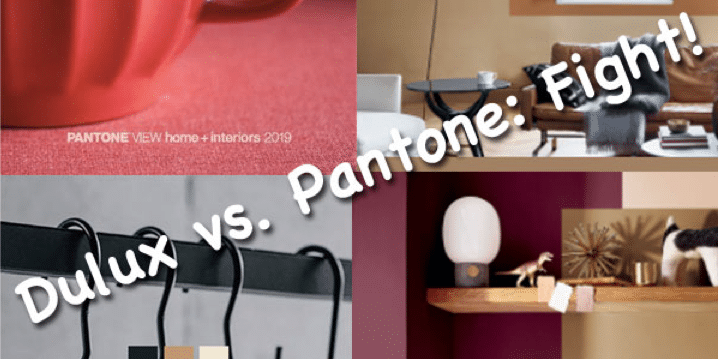
In the interests of fairness, I thought you’d like to see and compare Colour of the Year presentations from Pantone and Dulux. You, after all, will be the judge.
On the left (should I say ‘In the red corner?’) is Pantone, and on the right is Dulux:

Dulux are calling their colour of the year 2019 “Spiced Honey”, by the way.
At GD Parvin, our neutrality must remain beyond reproach so I cannot reveal, even to you, any personal preferences that may, or may not, exist. And I will deny that I said that.
Our job, of course, is to do London’s best job of redecorating your walls, whatever the colour, and you’re always welcome to call me on 0208 946 5045 to arrange a quotation.
Best wishes
Geoff Parvin
In Technicolor